JFF is a national non-profit that drives change in the American workforce and education systems to achieve economic advancement for all.
2016-2020 - Senior Graphic Designer
Challenge:
As a national non-profit, JFF was looking to expand their reach, but were coming up against some problems. The first, was overall efficiency in outputting the quantity and length of designed publications for their numerous sub-brands. The second was the need to strengthen the brand image of the non-profit JFF, as much of their efforts were being funneled into the 15+ sub-brands they established along the way.
Solution:
The mission was clear from the start, and it was that we needed to first unite the brand under one name and logo. Since "Jobs for the Future" was often reduced to just JFF, we focused on the acronym as the core name. Once that was established, we simplified and unified core messaging and established a transition plan for all the sub-brands. With any rebrand, there are many elements that need changing, updating, and adjusting. Our goal became to not only fully update all branded materials, but to empower the entire company to take part in this process. Our strategy of creating nicer products, better templates, and easier to access and use materials and pairing that with both group and optional one-on-one training led to a highly successful transition that lasted only one short year. As a result, JFF was able to step into national leadership and take center stage on difficult issues. Post-rebrand, they were able to get more grants at higher values, develop better media relationships and coverage, create more successful business partnerships, and create the nation's leading workforce and education conference.

Our first step was to update JFF's core identity to be more flexible and modern in order to match their bolder approach in messaging in education and workforce development.
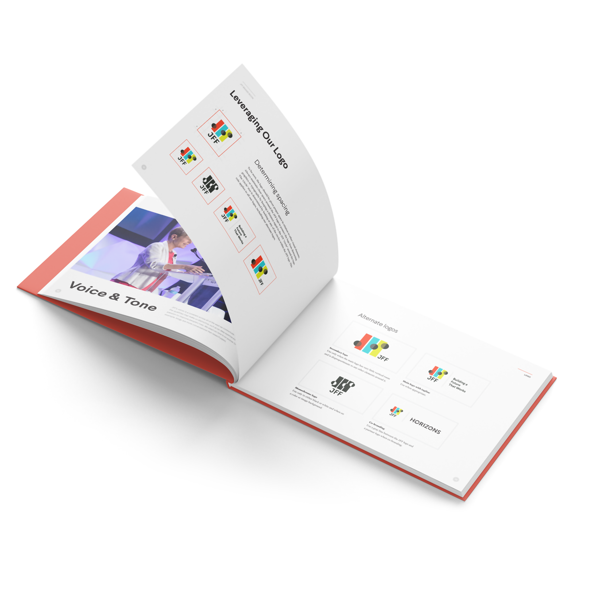
Fully new brand book, built within JFF to best speak to all employees clearly, as transition from a dedication to sub-brands to a main brand can be challenging.
New brand design concepts, so we could understand implementation challenges before they arrived.
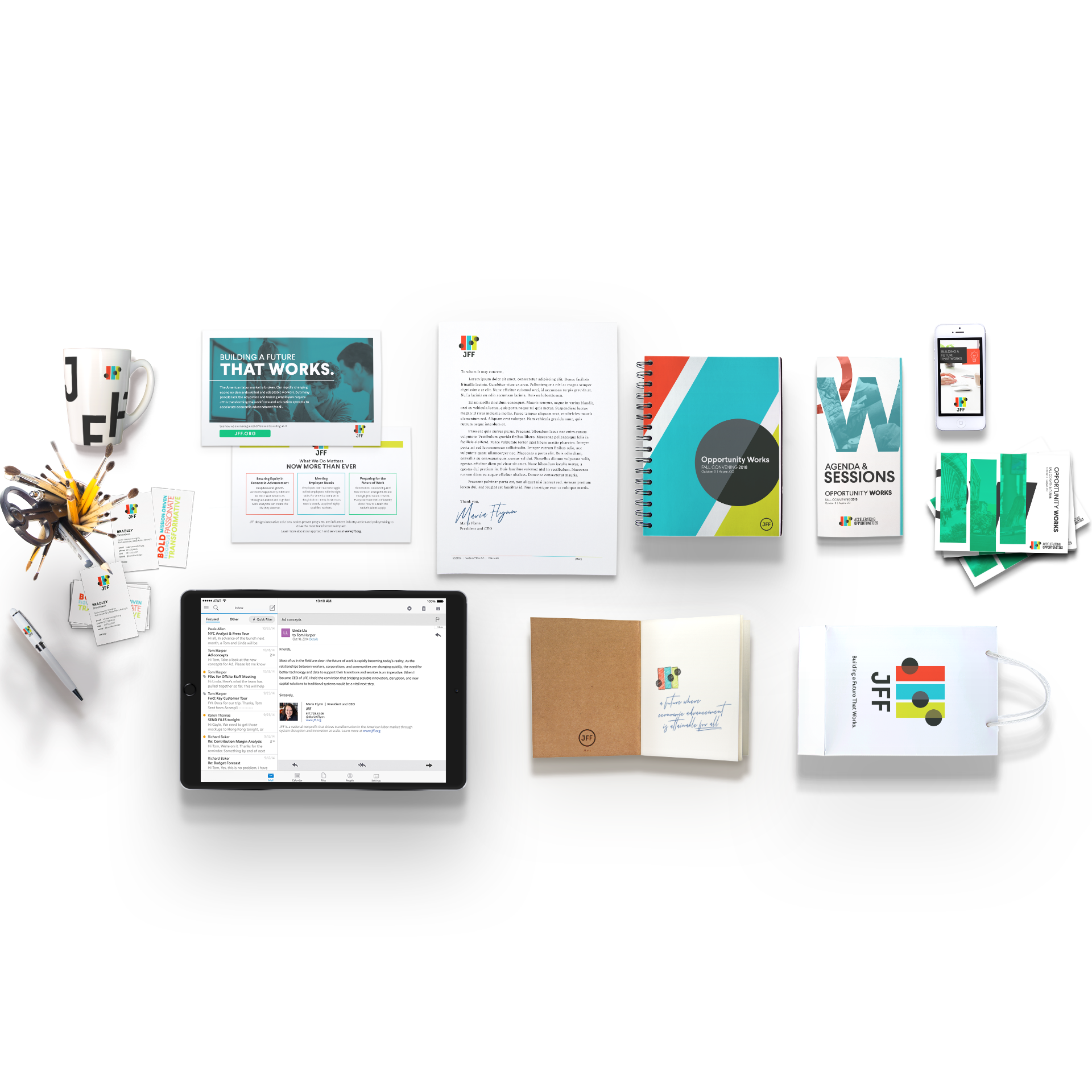
New 'high touch' publication templates allowed full control to make the most impact when needed.
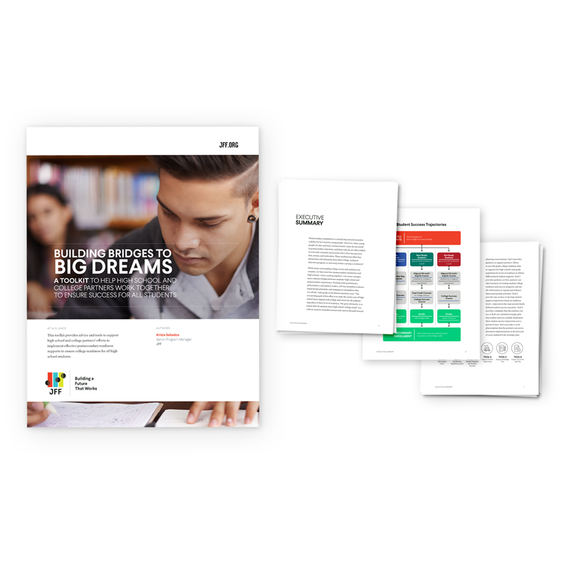
New 'low touch' publication templates were already leagues better than their original counterparts, but made production much faster, easier, and more efficient.
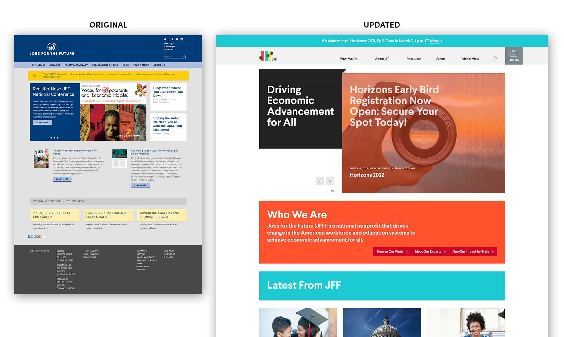
With a new brand comes a new website, and a new opportunity to streamline communication on the important issues JFF was working on. While the core design was done by an outside firm, our team was key in consulting on and shaping the design.
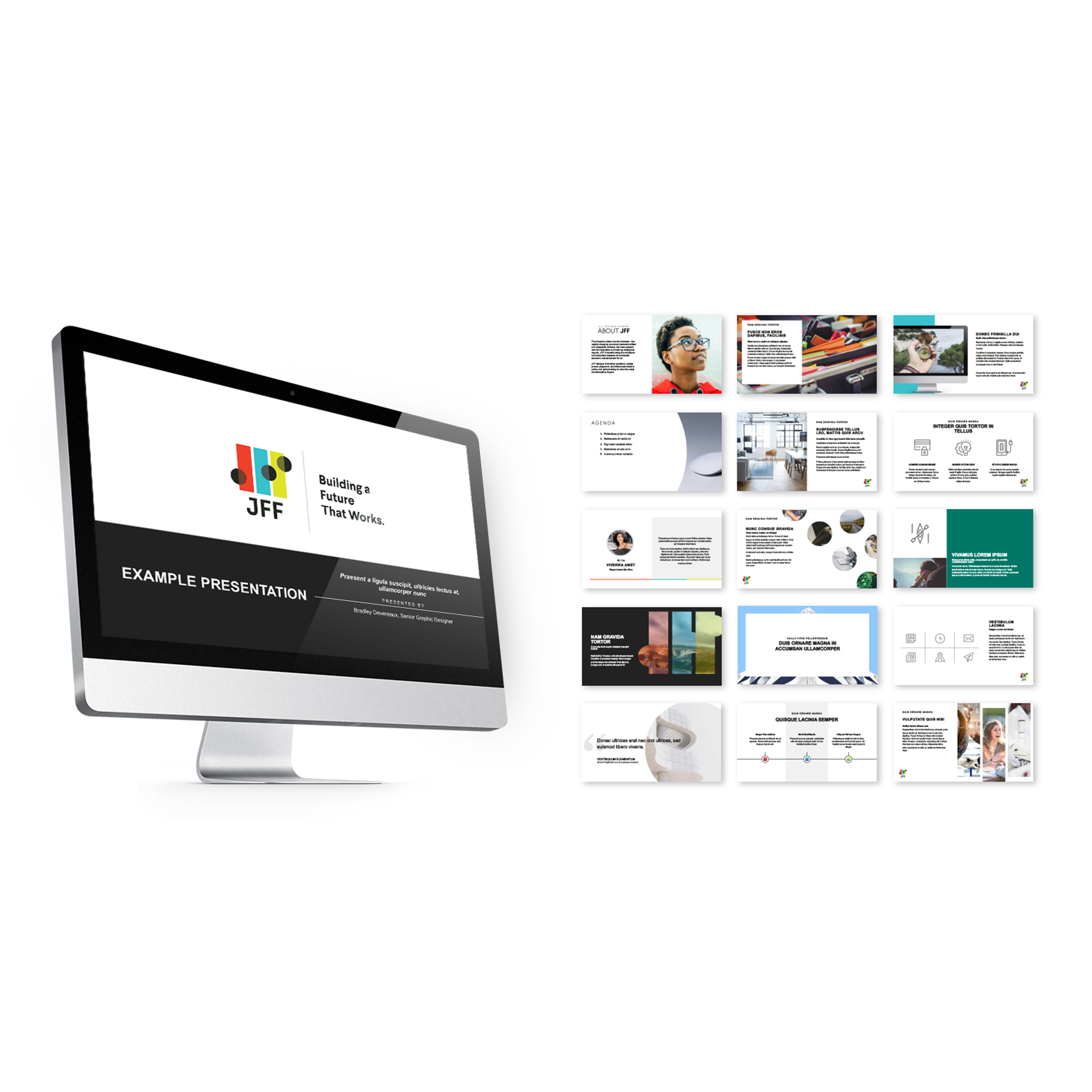
Powerpoint Presentations were rebuilt from the ground up with 3 versions: a 'lite' version, with photography and slide designs integrated, a 'normal' version, with over 50 custom slide templates and 750 searchable optimized images, and a 'master' version, for customized use on the communications team.
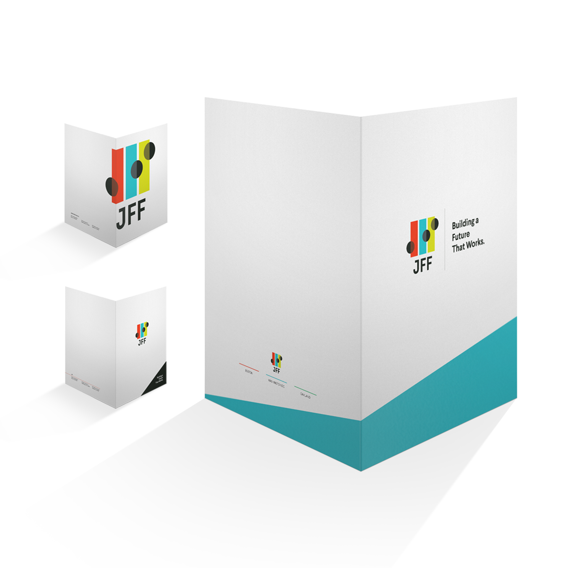
With so many events, new folders needed to be designed to get the audiences used to the new branding.
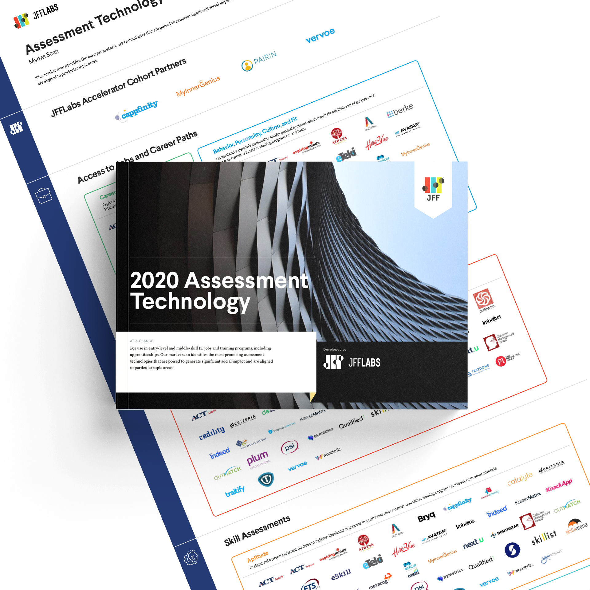
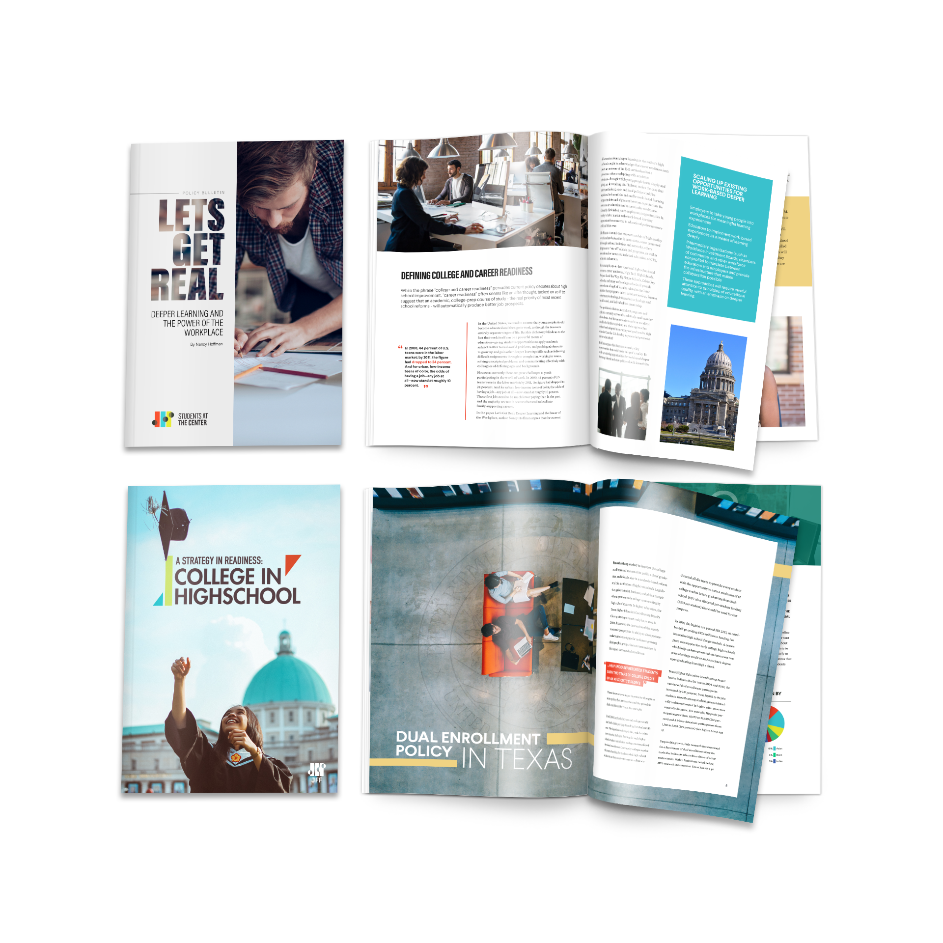
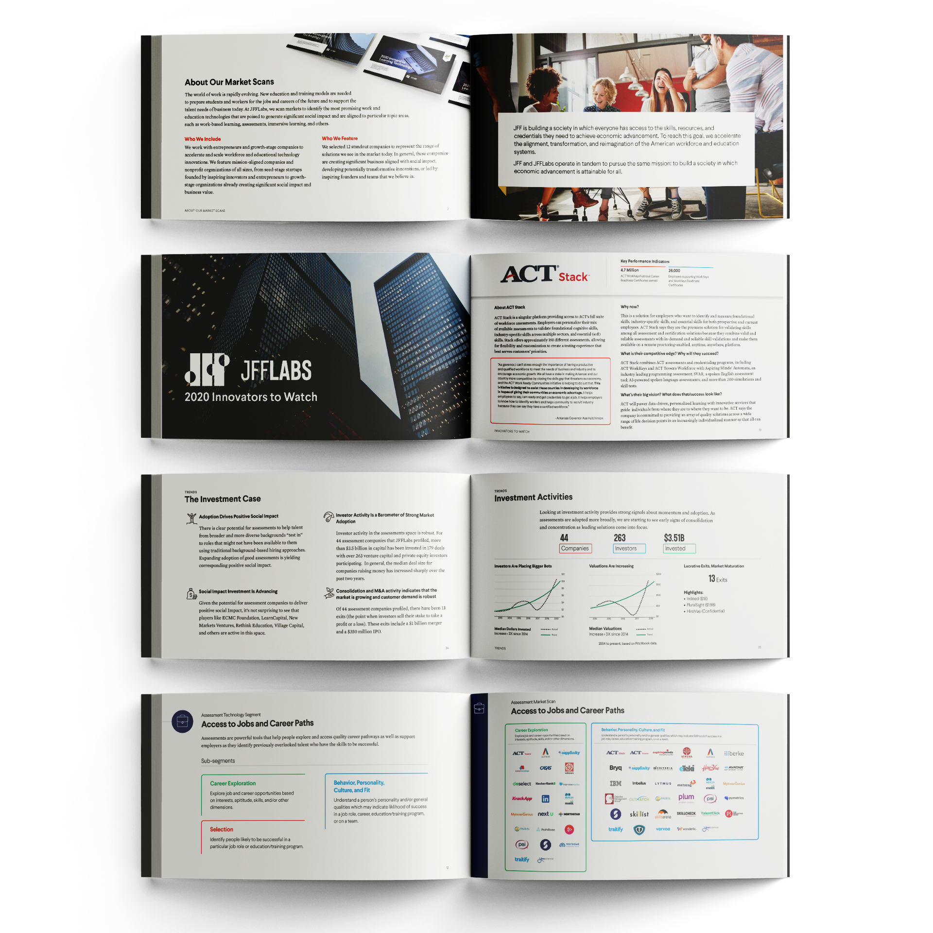
Data heavy projects like a market scan are always a design challenge, but within the new brand we had all the materials we needed to communicate clearly and effectively, and keep our work better organized and designed than our competitors.
While JFF was digital first, they hosted many events. As such, they needed their digital publications to be print friendly, so all projects were designed to easily transform into print.
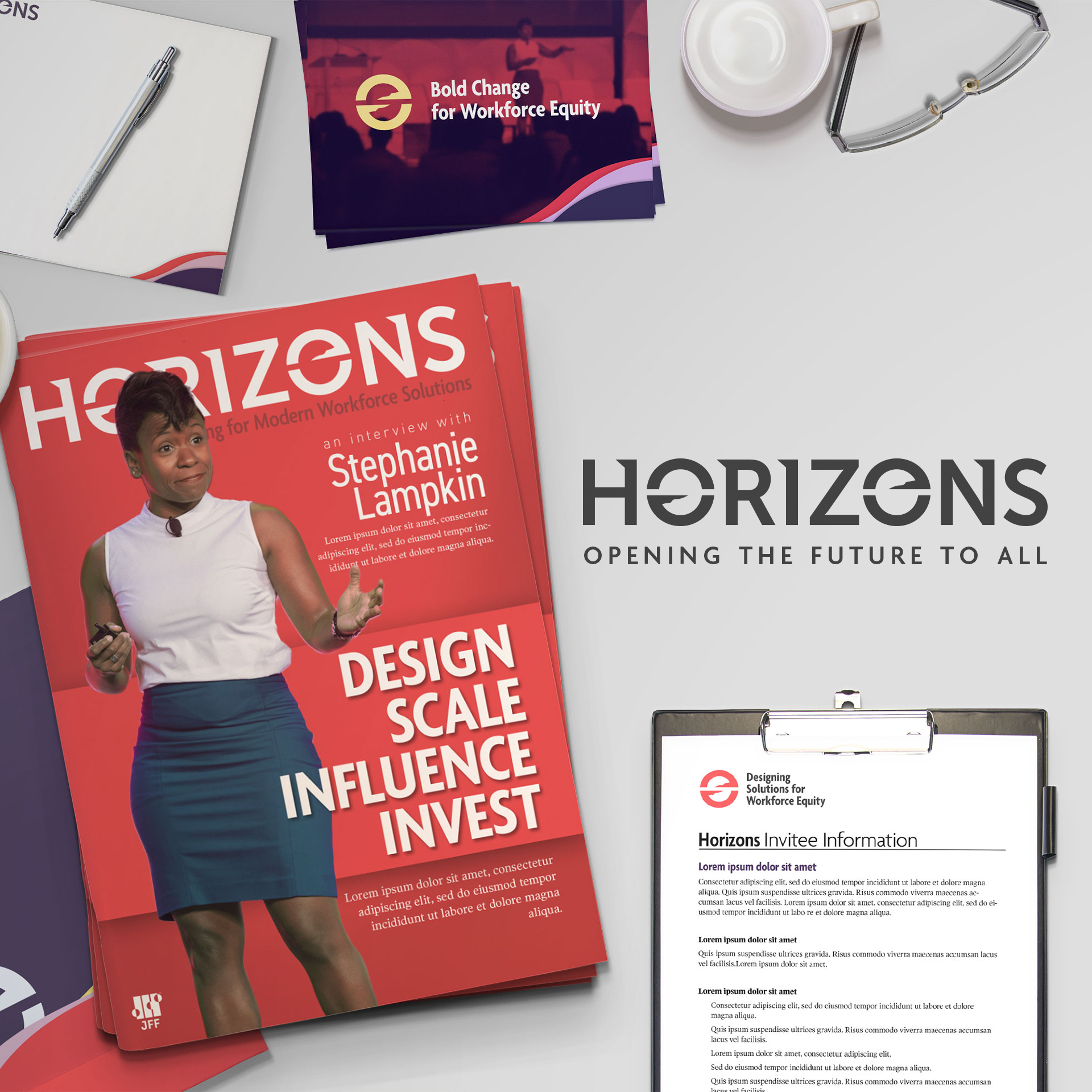
Horizons
Challenge:
With the rebrand in full swing, JFF was eyeing a bigger vision: a national conference to unite lawmakers, businesses, influencers, and on-the-ground workers to find the solutions to America's education and workforce issues. While this had been attempted in the past with some success, they wanted to make something that would last and grow.
Solution:
While tempted to style the conference after the new brand, we steered JFF leadership away from a strictly "JFF" branded conference. Instead, we developed "Horizons," an inspirational, ever-changing brand that could evolve with the times and themes. JFF would be the unchanging foundation, but Horizons could shake conference fatigue by changing its style, colors, fonts, and presence every year. With the original JFF conference gathering less than 500 attendees, Horizons sold out at 800 attendees and had to deny people at the door. The following conference was at the height of COVID-19, and a quick switch to a digital conference yielded over 8000 attendees.

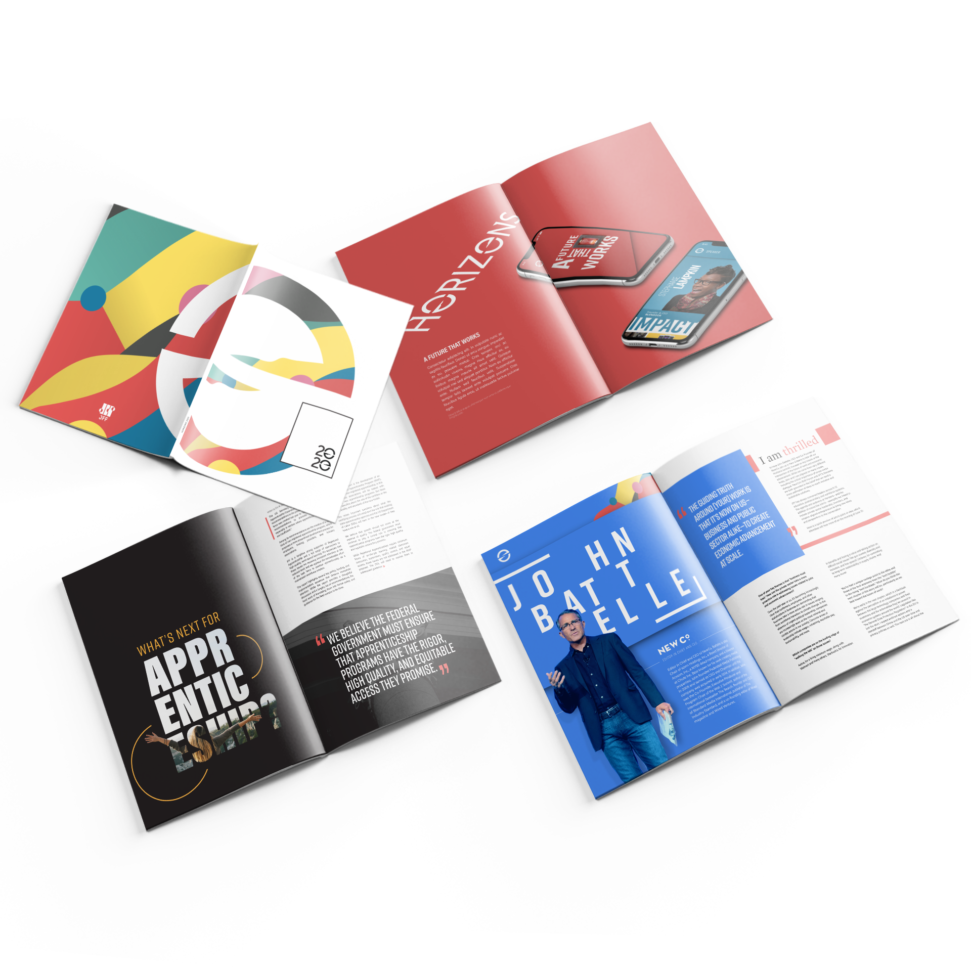
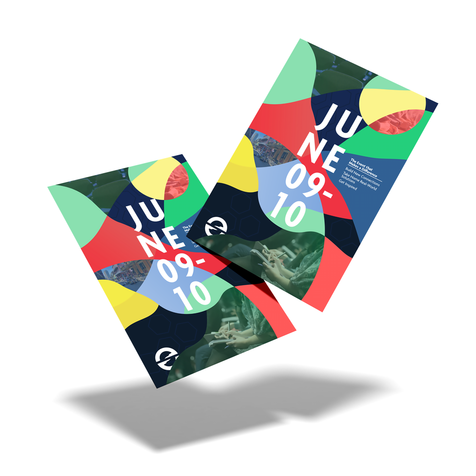
Print concepts for the 2020 Horizons conference, before the COVID-19 shut down.

Invitations to the 2020 Horizons conference, before the COVID-19 shut down.
Concept art for a new Horizons style.
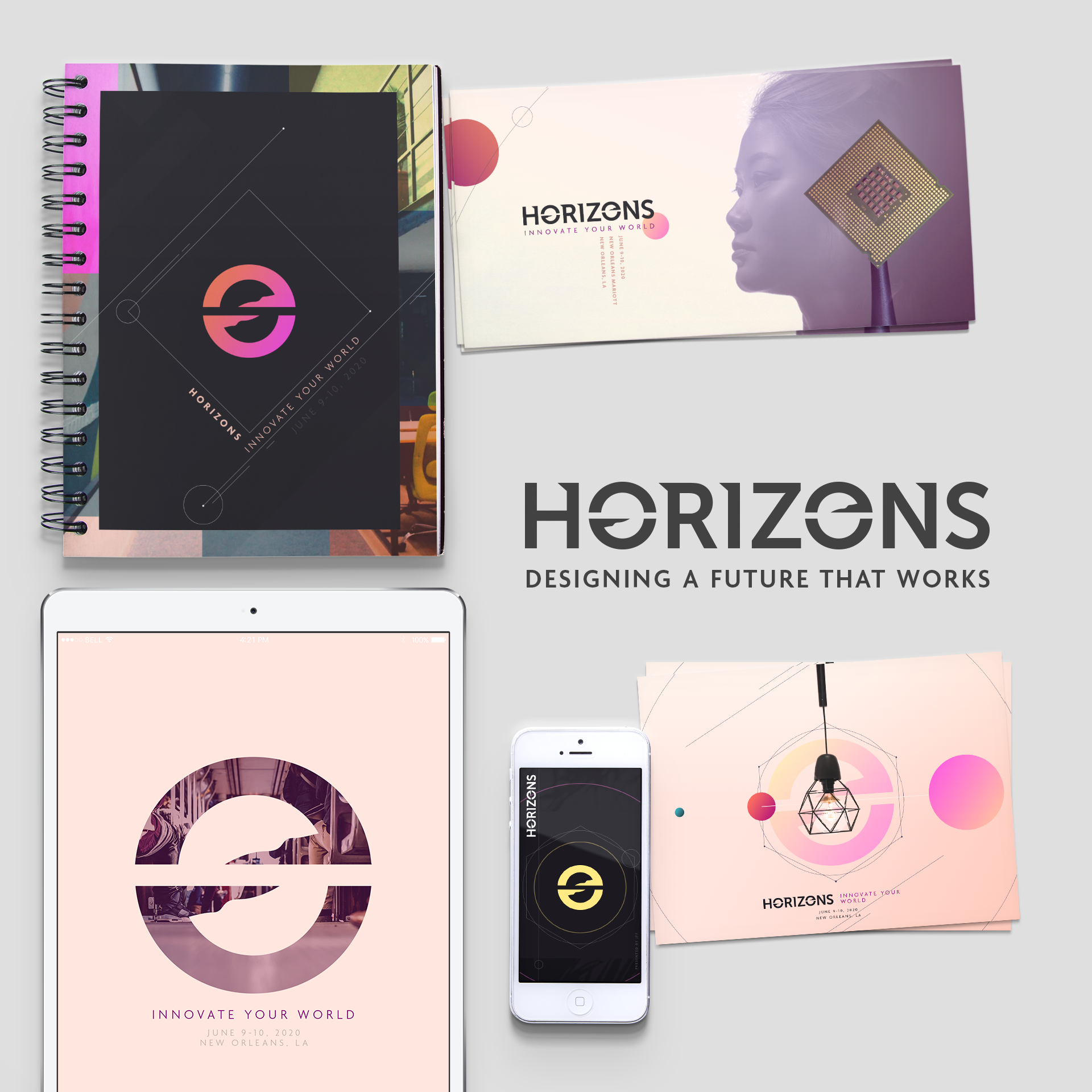
Concept art for a new Horizons style.
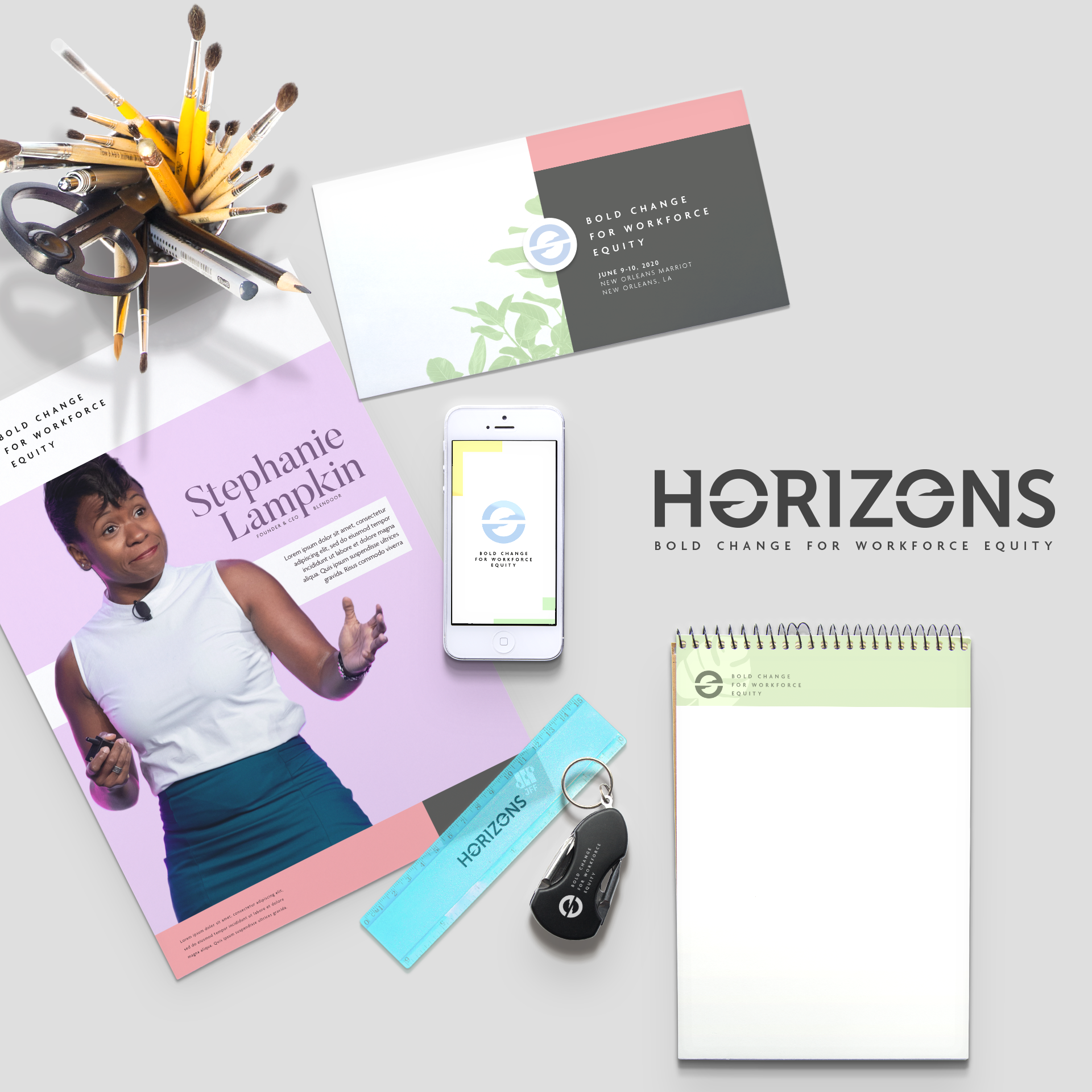
Concept art for a new Horizons style.
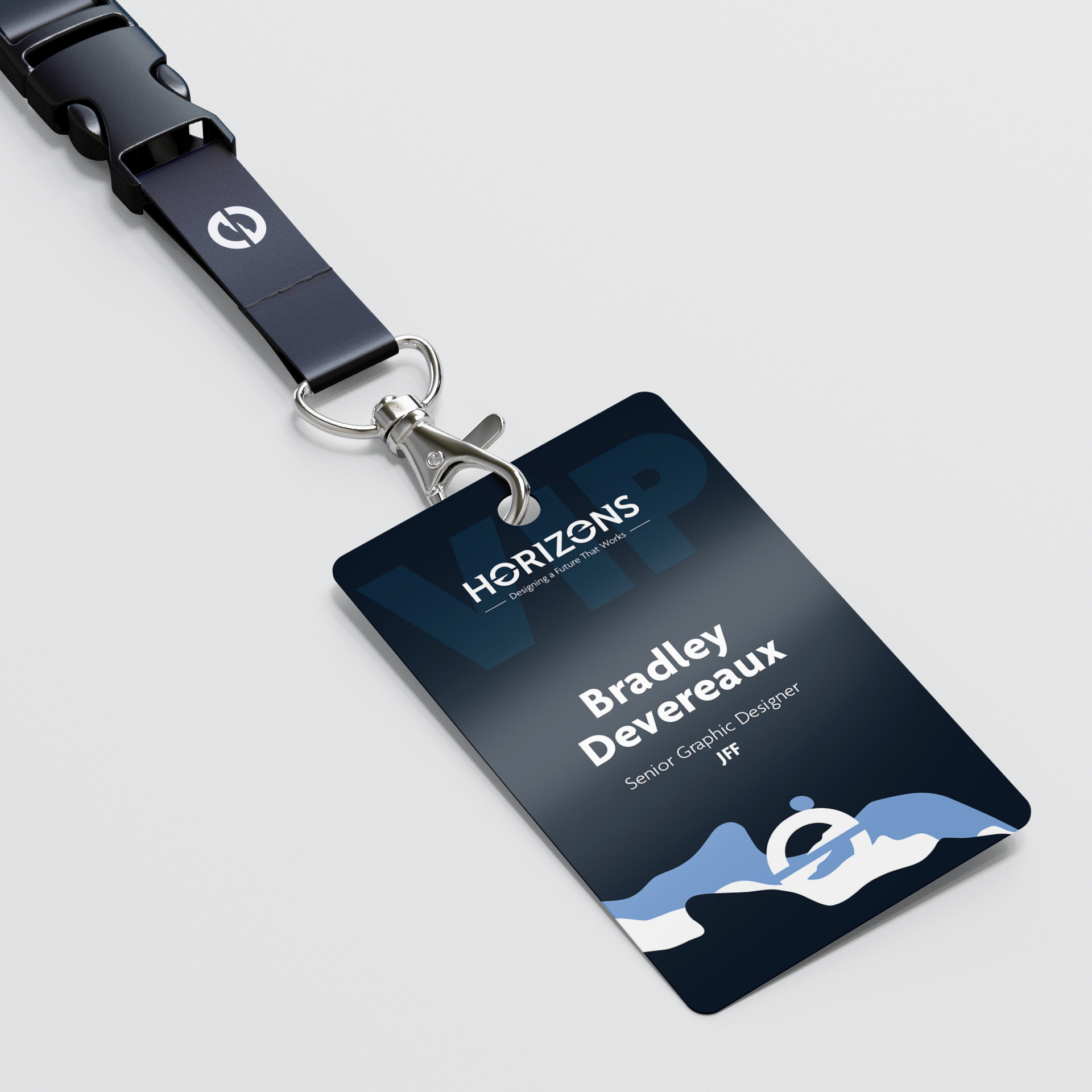
Design for the Horizons lanyard.
Design for the Horizons 2020 poster.
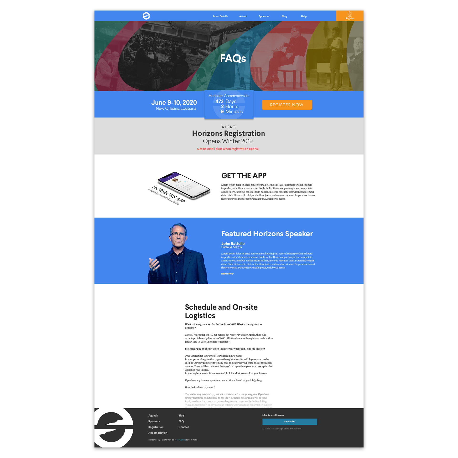
Design for the Horizons 2020 website. The website was built on a subdomain of JFF's website, and was highly customizable in comparison to allow for the styles to change every year easily.